The Invisible Hand of UX
A Design Narrative - April 2026
Role
- Front-End Development
- Prototyping
Team
- Solo
Timeline
- 3 Months
Overview
The Invisible Hand of UX is built for the rest of us. The people that are tired of designer jargon and just want to know why their apps feel "off". It uses curated demos to illustrate the considerations that go into the apps we use every day. Where possible, this project seeks to show, not tell.
In a sense, the project is a meta-exploration of trends in User Interfaces (UIs). It lets users see their own behavior reflected in the pages themselves. It leverages interactivity to introduce concepts that users have almost certainly seen before and establish a causal link between that term and the end it achieves.
Concept
The Original Pitch Deck.
In my work for the Design Club @ Pitt, I noticed that while members were able to see the value in the concepts I taught on principle, they struggled with properly internalizing those terms and applying them to their own work.
This isn't their fault. For a field that predicates itself on inclusion, the UX world contains an awful lot of jargon. New designers that would otherwise be interested in the field are left turned away by the needless complexity of the terminology that UX professionals use to describe their work. This makes it difficult for newbies to "see" the patterns they learn in the tools they use every day.
New designers see a complicated term, their eyes glaze over, and they forget about it before they can notice it incorporated into corporate work.
THE SOLUTION?
Build interactivity into the learning process.
Students LOVE getting their hands dirty. They learn better that way, too. A study conducted at Purdue University found that 8th graders who built a water purification device saw much higher test scores than those who followed a traditional lecture format. The proof is in the pudding. Hands-on learning is a powerful lever to engage students and help them internalize concepts.
Now, not every term is a good fit for a demo. Even if it were, it would be far too time-consuming to create a demo for every single one. But, by curating a wide swarth of demos that are both relevant and engaging, I was able to set this project apart from a traditional UX wiki and keep readers engaged.
By playing with the demos, readers are able to see the patterns in action and connect the term directly to the feeling of using it, rather than just reading about it in an abstract context. They can use this resource to notice patterns in the apps they use every day.
I planned to cover 50 unique terms. If that sounds ambitious, it's because it is. I wanted to make sure I was comprehensively covering the field and not just cherry-picking a few terms to make the project feel more manageable. Keep this in mind as we move forward because it will come up later.
Branding
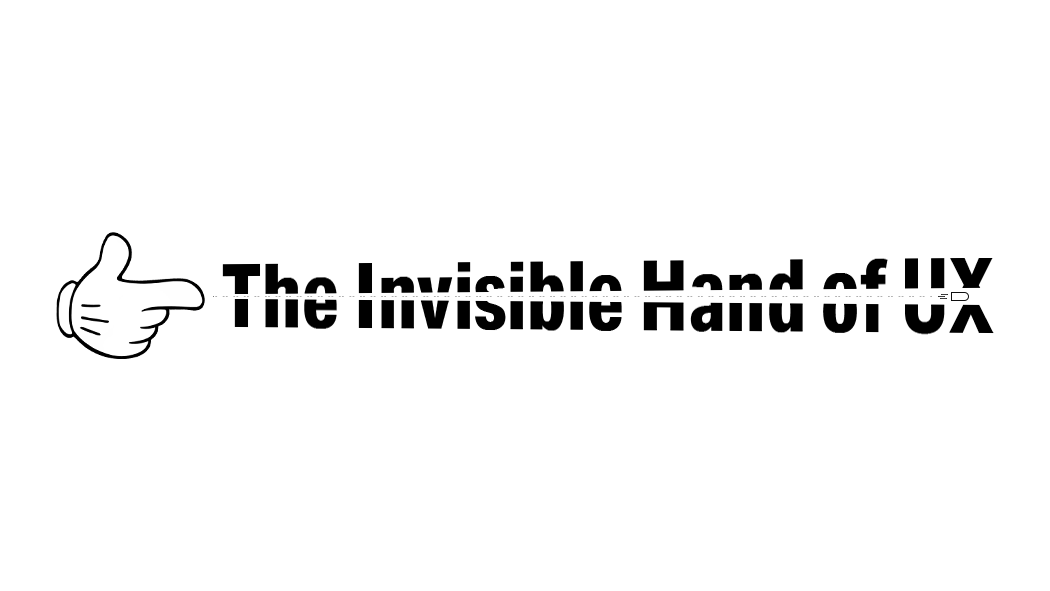
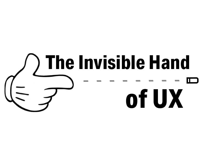
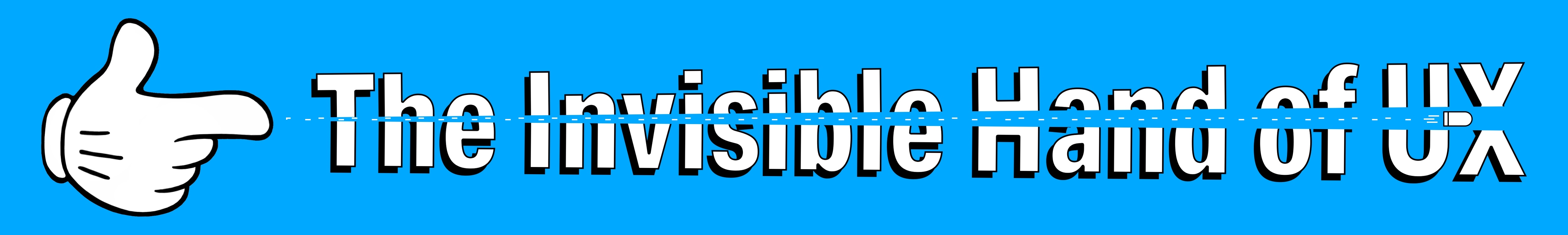
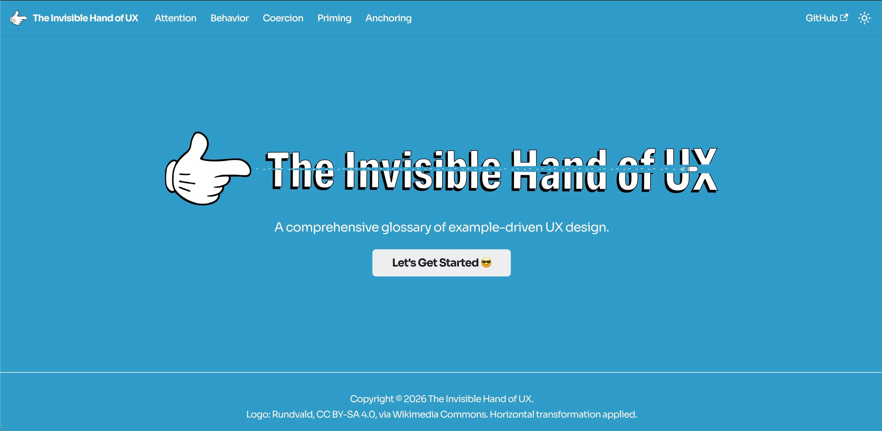
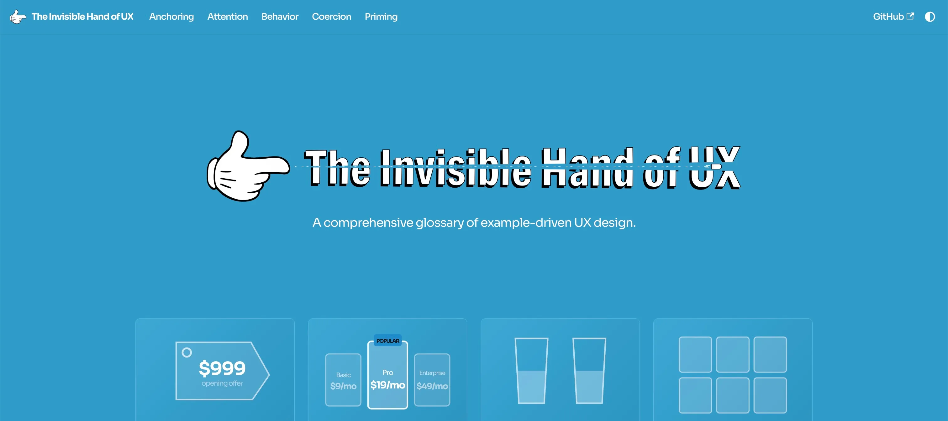
The name "Invisible Hand of UX" stems from the concept of an invisible hand guiding a country's economy. In this case, I wanted to apply that metaphor into the design world. I knew that I needed to include a literal hand in the branding to solidify the metaphor. This is how I ended up with the finger gun symbolism. Initially, the logos were relatively static and monochrome. But the mickey mouse style hand infused it with a bit of charm.
This had the pleasant side effect of shifting the project's focus from that of a pure UX learning tool to one that explores the intersection of design and behavioral economics. Many of the examples on the site are inspired by pricing ladders and checkout displays.
I wanted to imply that the interface is the one "in charge" of the user's experience. That the website itself will poke and prod at you until it gets its way. This "hand" of design is not to be underestimated, even if it's technically possible to sidestep the heuristic traps it throws at you. This is where the "shooting through the text" concept came from.
The branding evolution.
I implemented the blue color palette after looking over the aesthetic of denim brands. Old Navy and the Gap were major influences on the visual style of the project. Using solid opaque blues, especially in the dark mode, project a sense of depth and sophistication, without being monochrome and boring to look at. The contrast between those colors and the inclusion of the mickey hand gives the project a balance of depth and playfulness.
Prototyping
Initial layout prototyping, courtesy of Figma.
Because of the sheer amount of content I was presenting, the prototyping remained relatively minimal. I focused on presenting an interface that had a distinct "face" to it, while presenting as an empty canvas to overlay demos on top of.
Docusaurus did a ton of this work for me. Since it's built for documentation (it was used for React!), it has a ton of features to sort and organize the content you're looking to present into neat categories. It took a lot of the layout work off my plate so I could jump into development as soon as possible.
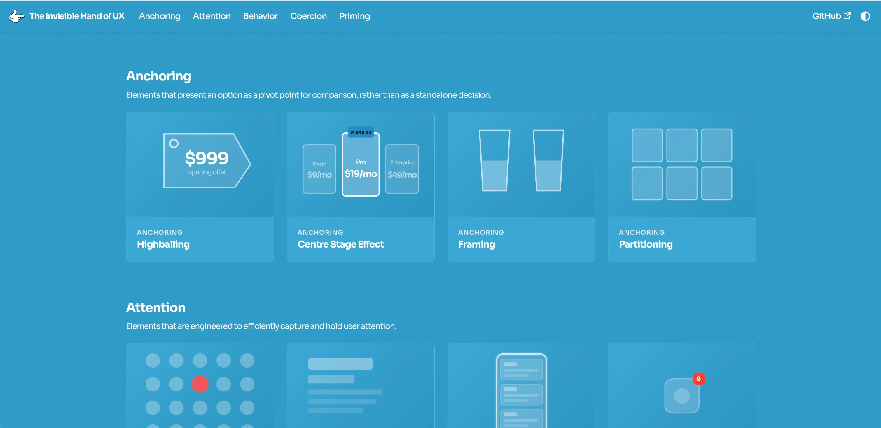
Eventually, I settled on 5 distinct categories to organize the terms I was presenting.
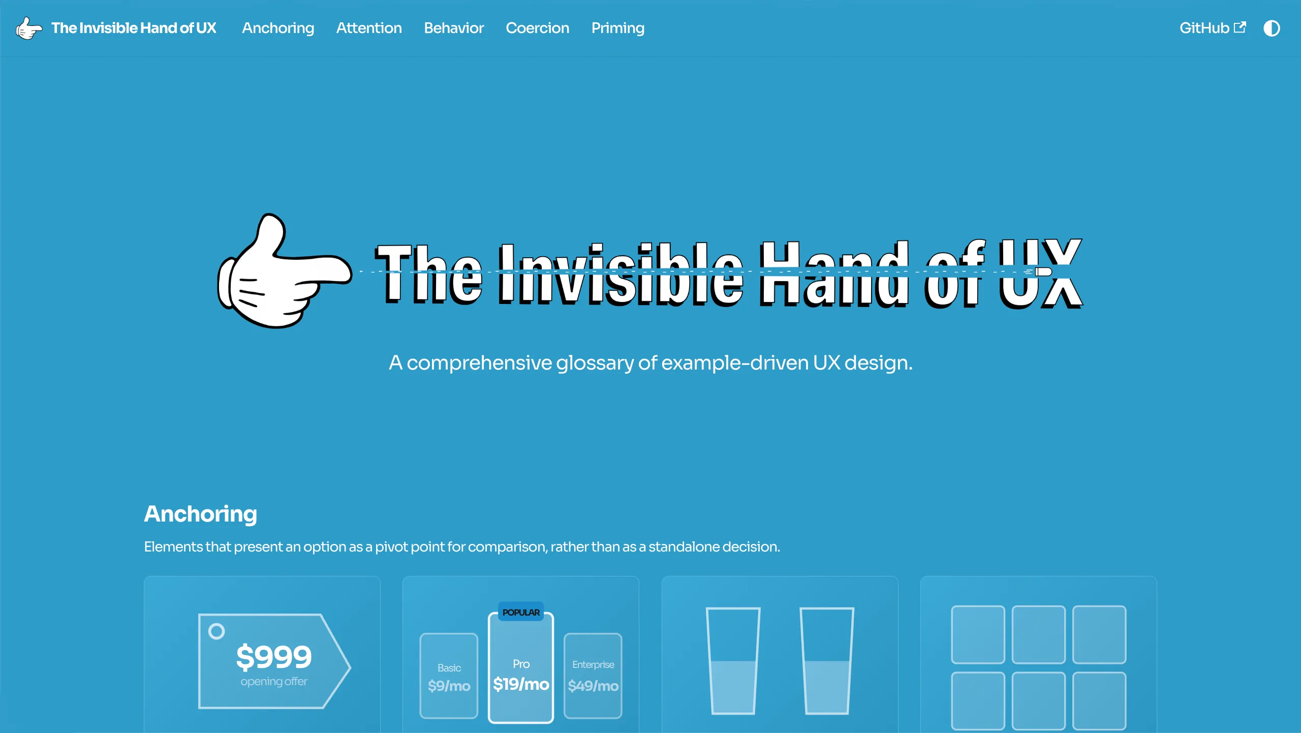
Anchoring
Elements that present an option as a pivot point for comparison, rather than as a standalone decision.
Attention
Elements that are engineered to efficiently capture and hold user attention.
Behavior
Elements that subtly play on human impulse to influence user behavior.
Coercion
Elements that are built to force users into decisions they may not otherwise make.
Priming
Elements that leverage context clues to prepare users to make a decision.
These 5 categories neatly mapped on to the terms I wanted to cover (more or less). Given the theme of the aggressive branding, I wanted to focus on principles that leaned manipulative, and these choices leaned in that direction. The interface itself presents relatively minimal to make space for the content to speak for itself. Despite this project being meta-textual, the demos should be the focal point, not the scaffolding around it.
Development
The bulk of my time was spent refining the animations and demos. That wasn't necessarily purposeful. This being for an English capstone, I initially believed that I would spend the most of my time writing out my posts. It turns out, even though AI was scaffolding a lot of the component architecture, there was still a ton of manual tweaking that needed to be done to make it feel right. And as good as these models are, it surprised me how often its visuals felt stiff.
There are far too many demos to go through each of them one-by-one, so I'll just highlight some of the high-level decisons I made regarding their implementation because there is plenty of ground to cover there.
Animations
First off, the animations. In order to make the animations feel springy, I needed to use math to give the animations a bit of inertia. This is where the concept of a bezier curve came in. To demonstrate this, here is the CSS for the finger gun animation that plays when the user hovers over the menu icon.
@keyframes logo-recoil {
  0% {
    transform: rotate(0deg);
  }
  10% {
    transform: rotate(-20deg);
  }
  100% {
    transform: rotate(0deg);
  }
}

.navbar__logo img {
  transform-origin: bottom left;
}

.navbar__brand:hover .navbar__logo img {
  animation: logo-recoil 0.5s cubic-bezier(0.25, 0.46, 0.45, 0.94) forwards;
}
There are a couple pieces to this. To start, the @keyframes bit
defines the initial animation. It consists of a rotation that starts at 0 degrees,
pops up right at the beginning of the animation to simulate a recoiling gun,
and then slowly returns back to 0 degrees. The transform-origin: bottom left; bit is important to ensure that the rotation pivot is set at the bottom left
corner of the icon.
The part that makes it actually springy is in the cubic-bezier(x1, y1, x2, y2) bit. This function defines the way time progresses through the animation.
The x1 determines when the motion starts accelerating, the y1 determines how aggressively it launches, the x2 determines when
the animation starts settling down, and the y2 determines where
it ends up. Try it for yourself here!
Easing curve (time → value)
logo-recoil preview

Graph updates live; preview replays shortly after you change a value.
Colors
Managing colors on a large scale like this was more of a technical challenge than I had anticipated. Since this application has a light and a dark mode, colors needed to be conditionally defined, such that they would render correctly in both modes with the correct contrasts.
Working in two distinct formats (Markdown and React Components) presented more of a challenge than I had originally expected. I had to find a way to make my colors cascade down to work in both formats. Here's how I did it:
/* custom.css */
:root {
  --dnid-brand-50: #b8e0f0;
  --dnid-brand-100: #5bb5db;
  --dnid-brand-200: #42a8d4;
  --dnid-brand-300: #2e9cca;
  --dnid-brand-400: #1a8ccc;
  --dnid-brand-500: #177db8;
  --dnid-brand-600: #1576ad;
  --dnid-brand-700: #12618f;
  --dnid-brand-800: #29648a;

  --dnid-neutral-0: #ffffff;
  --dnid-neutral-50: #f9fafb;
  --dnid-neutral-100: #f3f4f6;
  --dnid-neutral-200: #e5e7eb;
  --dnid-neutral-300: #d1d5db;
  /* ... */

  [data-theme="dark"] {
  /* ... */
  --dnid-neutral-50: #2a2b3e;
  --dnid-neutral-100: #32334a;
  --dnid-neutral-200: #3d3f55;
  --dnid-neutral-300: #4b4d66;
};
Global CSS variables! Defining my colors in a central location allowed me
to quickly throw in my branded colors based on a luminosity scale. All I
had to do was throw in a var(--dnid-brand-###) into my code in
place of the color and it worked out of the box. The best part? The [data-theme="dark"] block allowed me to overwrite these existing variables automatically when
the user's theme was set to dark, whether by the system default or manually.
Introducing the colors in this way pushed them out of my way and made it a non-issue to quickly insert blues and grays into my landing page, term pages, and demos as I needed them. Building this system from the top down was a huge boon for my productivity.
Demos
The demos ranged a lot in complexity, but the biggest principle I needed to adhere to was re-using generic components (buttons, windows, etc.) as much as possible. This A: saved me AI tokens and B: made the development process a little speedier.
Hello World!
The same macOS-style chrome wrapped almost every demo.
The most obvious re-used component was the macOS style window chrome that wraps around a ton of the demo content. If there is a need to separate something from the page or give it its own "container", I would just throw it in this generic window. It saved me a ton of time that would have otherwise been spent on creating new window frames for each demo.
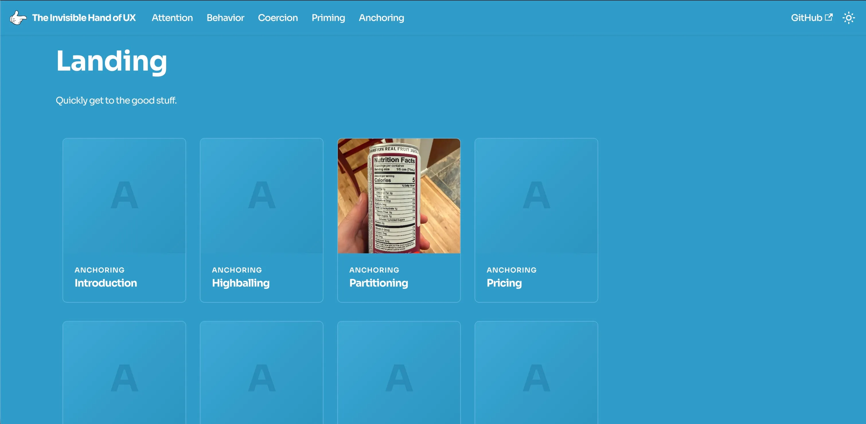
I also noticed that a lot of the terms I described could be pretty eloquently explained through the use of a pricing ladder, especially in Anchoring. Being able to re-use this same pricing ladder cross-terms saved me a ton of time and effort that could be spent making the other demos as good as they possibly could.
But before I knew it, I was midway through the semester, and leveraging code re-use and agentic programming simply wasn't cutting it. I needed to adapt my approach.
THE PIVOT
Cut down the terms to a more manageable number.
I cut the number of terms covered from 50 to a range between 25 and 30. This was a tough decision. I really wanted to make this project comprehensive, but I was beginning to realize that by focusing on the size of the number, I was sacrificing the quality of the content I was covering.
This ended up having a number of positive side effects. By focusing on a smaller number of terms, I was able to give more terms interactive demos, rather than falling back to static images. This bolstered the project's core purpose of showing, rather than telling.
Animated previews nested in each landing page card.
Reducing the number of terms I covered also allowed me to incorporate animated SVG previews into all 20 card previews on the landing page, rather than falling back to static images. This let me loose to get creative with the design of the landing page, rather than displaying static images on a grid. It breathed new life into a page that initially felt stale and lackluster.
A cross-linked term.
Most importantly, focusing on quality over quantity in my term coverage allowed me to go into much greater depth on each one. I was able to cross-reference terms with one another and provide much more context around where each term fits into the greater UX design sphere.
I'm glad I made this pivot. It saved me a ton of headaches, and led to this project feeling much more cohesive and polished in its conclusion.
Testing
This is where it gets fun. A LOT of the design decisions I made were informed by the user feedback I recieved throughout development. The landing page navigation illustrates this perfectly.
The initial landing page design was split into two screens.
Initially, the landing page was completely separated from the home page. In truth, this was done to re-use the button that Docusaurus had provided me out of the box. I wanted it to be used for something. But this simple interaction proved that I had a few blind spots. Classmates of mine that used the button noticed a few key issues:
Barrier to Content
The visual grid was one of the coolest parts of the wiki, and hiding it behind a button made it so users could very easily miss it. If users went to the menu bar first, they would have completely avoided the grid.
Confusing Naming
What is "Get Started"? What does it mean to get started? It's not clear. A phrase like "Explore!" would be more indicative of the type of page it would take you to. Even something like "Learn More" would be better.
Extra Navigation
The button acted as an extra click that was wholly unnecessary. Since the menu button on the top right returns the user back to the home page, every time they wanted to get back to that pictoral content, they had to click two buttons instead of one.
Clearly that button wasn't going to fly. I needed to try something else.
The landing page merged with the home page.
I decided to merge the landing page with the home page and place it on its own separate page, rather than existing as a "document" in the home page. After testing with classmates, it was clear the extra click was completely unnecessary. Placing the grid right above the fold made it so users could see it immediately, and it didn't detract from the logo design as much as I would have guessed.
Eventually, the grid morphed into a more traditional layout with sections.
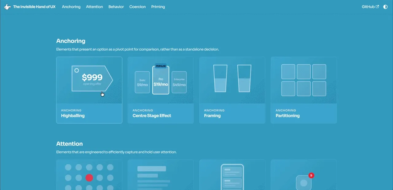
After more time consulting with classmates, it became clear that the categories weren't well explained. What actually is anchoring? What does priming entail? It's mostly left up to the reader to infer based on the examples. I reworked the existing landing grid to split up the cards by category. Each category now has a full header and description to reinforce the categorical structure of the page.
A tooltip to the light/dark mode toggle.
In the same vein, I added a tooltip to the light/dark mode toggle to help users understand the difference. Although many users can infer that a sun means "light" and a moon means "dark", the system default setting isn't nearly as intuitive. These small details helped smooth over hitches for users who hadn't built up that mental heuristic just yet.
Summary
In the end, I was able to create a wiki that functioned both as a learning tool and as an extensive technical showcase. It serves as the perfect cap to my Digital Narrative and Interactive Design (DNID) degree. One that guides readers through the non-fiction narrative of UX design, evoking open communication around the topic and encouraging collaboration through user feedback.
An "Edit this page" button gives anyone the ability to contribute to the site as they wish. The hope is that this project will be picked up by the community and be iterated upon as a community-driven resource. UX thrives when it's applied in the real world, and this project has illuminated that fact.