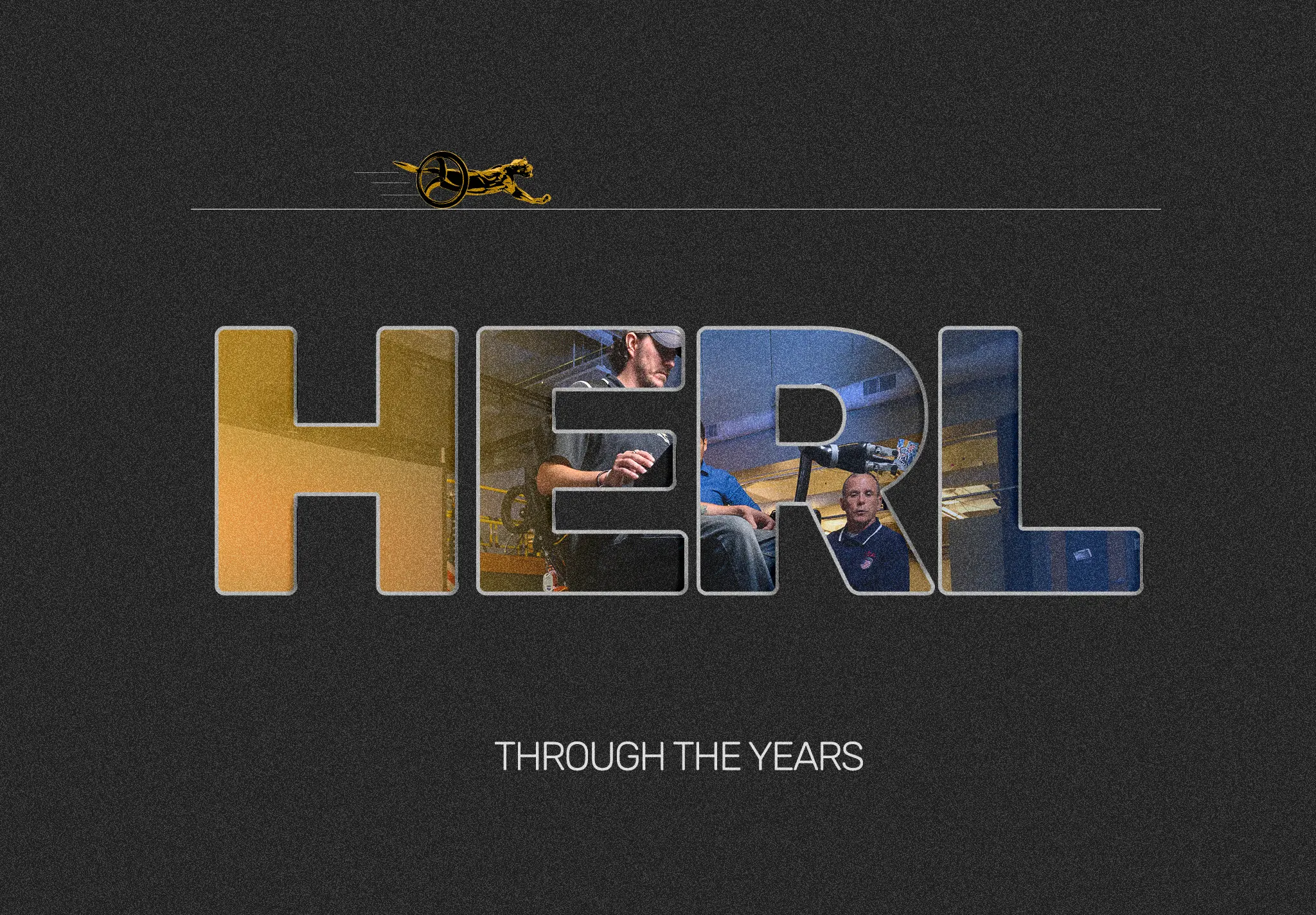
HERL Through The Years
Human Engineering Research Labs - September 2024
Role
- Front-End Development
- UI + UX Design
Team
- Solo
Timeline
- 3 Months
Overview
This project is an interactive digital book for the Human Engineering Research Labs (HERL), a research lab at the University of Pittsburgh. It transforms their physical historical booklet into an interactive web experience, creating a performant and visually appealing app that maintains the look and feel of a physical book without their physical limitations.
Context
The project began when I learned of Human Engineering Research Labs looking to hire a HTML/CSS intern to complete a semester-long project. Coming off of the heels of IIP: Berlin, I had gotten a taste of the working world, and wanted to push things a litle further. I got plenty of experience with WordPress over the summer, but I knew that I needed to drill down on my fundamentals. I shot out an application with absolutely no expectations, and was pleasantly surprised when I got the interview.
I met with my HERL contact, Agustin Urioste, and got to work. I expected to enter work with a stringent set of requirements, as is expected of most internships. All they wanted was from me was to transform their 30 year history booklet into some sort of web page. They wanted it to include the images and description assets they provided and make it embeddable into an iframe, but the rest was fair game. I was given free reign to take this project nearly wherever I wanted for school credit, and couldn't be more thrilled.
So here is a condensed timeline of this cool project, week by week.
Week 1-2: Foundation & Graphics
Development began with planning and storyboarding. I wanted to create a skeumorphic layout that preserved the visual metaphor of a physical book rather than retrofitting the book into a web format. Needing to embed everything into an iframe introduced several constraints:
Readability in Smaller Windows
Content needed to be readable in a small window without overwhelming users. This meant careful consideration of font sizes, spacing, and layout density to ensure the interface remained usable even at constrained viewport dimensions.
Avoiding Scrolling
Scrolling had to be avoided to maintain the visual metaphor of a physical book and provide a better user experience. In the context of an iframe, scrolling feels unintuitive and disorienting, so all content needed to fit within the visible area of the screen.
Performance Criticality
Despite being embedded in an iframe, the app needed to run on a separate page on a fairly antiquated server, so it needed to run as quickly and smoothly as possible. This required careful optimization of assets and code execution to keep it from slowing down the server.
To address the performance concerns, I chose Svelte over React. While React is an excellent framework, it relies on a Virtual DOM that must be shipped with the JavaScript. Svelte compiles down to native JavaScript at build time, without any additional layers of abstraction, making it ideal for an embed.
Initially, I tried using Three.js and Threlte, but they ended up being too complex for the 3-month timeline. The
pivot to CSS's transform-style: preserve-3d created convincing
enough 3D animations that I felt comfortable using them. They not only ran
better in modern browsers, but were much more likely to play nice with the
server, making their relative inflexibility worth the trade-off.
Week 2 brought page navigation with arrows and keyboard controls, plus the ability to flip the book when closed. Though handling animations through JavaScript/TypeScript was slow relative to CSS, it was worth it for the flexibility it offered. There was simply too many potential app states to handle with the limitations of CSS alone.
Using TypeScript, I created a "holographic" effect that makes the book feel tangible as the mouse slides across its surface. You can see it in the Svelte demo displayed at the top of the page. Here's the code responsible for that effect:
function handleMouseMove(event: MouseEvent) {
      if (!isHovering || isOpen) return; // Don't animate if the mouse is not hovering or the book is open
      const rect = book.getBoundingClientRect();
      const x = event.clientX - rect.left;
      const y = event.clientY - rect.top;
      const centerX = rect.width / 2;
      const centerY = rect.height / 2;
      tiltX = ((y - centerY) / centerY) * 10;
      tiltY = ((centerX - x) / centerX) * 10;
}
Week 3-4: Responsiveness & Content
Week 3 focused on making the book responsive for different screen sizes. Since this would be displayed in an iframe, it was important that it rendered well on smaller screens. The content needed to stay consistently legible for both screen widths down to 450px and screen heights down to 500px, since I couldn't be sure how small the frame would actually be rendered. Week 4 brought the actual content being added to the page, with all milestones laid out year by year.
The main challenges during this phase involved balancing content density with readability:
Responsive Design
The book and content were made responsive by adjusting font size based on screen width and height. The content window doesn't overflow when the screen is small, maintaining legibility across different screen sizes.
Content Implementation
Milestones were fully imported with associated images. The layout required scrolling initially due to the amount of content. A cursive text texture from Adobe Stock was added to lean into the skeumorphic design, though it introduced some performance issues.
UX Issues
Displaying so much content without the book getting in the way became a significant UX challenge throughout the course of the project. The scrollable layout was a temporary solution, with plans to address this through creative resizing or expandable milestones.
Week 5-6: Polish & Performance
Week 5 introduced a bunch of quality-of-life features. A lightbox view for enlarging photos on smaller screens, description shortening with expand/collapse functionality, and a bunch of other minor improvements. Week 6 was primarily bug fixing, addressing the persistent image rendering issue and optimizing performance issues related to page turning.
The description truncation system was pretty straightforward to implement. It just used a simple utility function to truncate the description to a given length within the component:
<script lang="ts">
const truncate = (description: string, maxLength: number) => {
    if (description.length <= maxLength) {
      return description;
    }
    const truncated = description.substring(0, maxLength - 3);
    return truncated + "...";
  };
</script>

<button on:click={openModal} style="cursor: pointer;" aria-label="description">
  {truncate(content, length)}
</button>
The lightbox required me to use npm i --legacy-peer-deps to work
around compatibility issues. This allowed package conflicts to run completely
unchecked, meaning that I had to keep an eye on the console for potential
errors going forward. I couldn't guarantee that all of my packages would work
together moving forward. Here are some of the big improvements that were made:
The New Lightbox View
Images could now be enlarged on smaller screens, improving UX for users on smaller screens, and allowing the pictures to be displayed smaller to leave room for the description text.
Content Positioning
The app content was centered on the Y-axis, eliminating the need for scrolling in (most) cases. This was crucial for the iframe embedding to work as expected.
Performance Fixes
Fixed some random bugs with images not rendering after going through the deployment pipeline, and addressed some issues related to page turning. I also optimized the "fake text" texture to make the book flip smoothly regardless of content density.
Week 8-9: The Pivot & Optimization
Week 7 was a mental health break. I just needed some time off after going full-tilt throughout the whole semester. After which, I made the critical decision to abandon responsive design for multiple screen sizes. Since the app would be displayed in a fixed iframe anyway, I settled on 1000 x 750 pixels following a 4:3 aspect ratio. This gave the book enough height while maintaining landscape orientation, with strategic downsizing at breakpoints for smaller devices.
This pivot enabled massive improvements. Each year now got its own page, blowing up the book to 30+ pages. Scrolling was entirely removed, creating a more seamless presentation that fits better with the book metaphor. Several major changes accompanied this shift:
Fixed Dimensions
Abandoning multi-size responsiveness for a fixed 1000 x 750px dimension was a worthwhile concession. This allowed focus on content quality over how responsive the app could be.
Content Transitions
Week 9 revamped content loading with delays to prevent browser overwhelm. Content, modals, and icons fade smoothly on hide, creating a more polished experience. Years were now styled with colors matching the initial booklet design.
Image Preloading
Images now preloaded 5 pages in advance using Svelte Stores, creating seamless page transitions even when jumping multiple pages. Grey placeholders flash if the server responds slowly, providing better UX than vanilla alt tags.
Here's an example of how the image preloading was done in code (at a high level):
// Runs for the next five pages after the current page
async function preloadPageImages(pageNum: number) {
  if (pageComponents[pageNum]) {
    const images = await getComponentImages(pageComponents[pageNum]);
    await Promise.all(images.map((src) => imageLoader.preloadImage(src)));
  }
}
Week 10-11: Final Polish
The final weeks brought in the bookmark navigation system and some finishing touches. Bookmarks were added at strategic years (1995, 1996, 2001, 2004, 2011, 2023) where HERL had hit major research milestones. Each bookmark was positioned vertically along the right edge of the book, working in both closed and open states. Each bookmark would dispatch custom events to either open the book directly to a target page or navigate to the target page if already open.
The bookmark system directly addressed the UX concerns of having 30+ pages to flip through. Users could now jump around the book as needed, using major milestones as landmarks in HERL's timeline. The final week added polish that elevated the entire experience:
Bookmark Navigation
Bookmarks are positioned vertically along the right edge, featuring dark tab-like styling with vertical text orientation. They grow larger when the book opens (width: 2.5rem to 3.5rem) with smooth state transitions and active styling to indicate current section.
Book Flip Animation
The book now flips to its backside when clicking past the last page. Handling multiple variables to track the state of everything was challenging, but the "backward closing" animation still adequately conveyed the idea, even if the animation itself was a bit janky.
Quality of Life
Page numbers on the bottom right help track position. The "Skip Ahead!" prompt with a curved arrow svg guides users to bookmarks, directing the user to the bookmarks as a core feature of the app. Device width prompts appear below 800px, guiding users to switch devices rather than try to rotate the screen.
The tutorial prompt positioning uses some clever TypeScript to get the book's bounding box without inheriting its 3D transformations:
// Updates whenever the page is resized
function updatePosition() {
  const bookElement = document.querySelector(".book");

  if (bookElement) {
    const bookRect = bookElement.getBoundingClientRect();
    promptPosition = {
      right: `${window.innerWidth - (bookRect.right + 310)}px`, // 40px offset from book
      top: `${bookRect.top - 60}px`, // 20px from top of book
    };
  }
}
In the end, the final product successfully transformed HERL's physical booklet into a delightfully engaging digital experience. The fixed dimensions, bookmark navigation, image preloading, and smooth animations created a performant, skeumorphic interface that maintained the idea of a book while leveraging modern web technologies to create a seamless experience for their website. While not perfect, this project really demonstrates the power of 3D in CSS and the flexibility of the Svelte framework.